Have you built a landing page, but it is not bringing in the desired results to you? The most probable reason for this is that the landing page is not designed/optimized properly, due to which the customers move out quickly.
An ineffective landing page that does not bring you any conversion is as bad as having no landing page at all. You may have loads of traffic coming to your site but unless they convert, your business will not grow.
Table of Contents
What Is A Landing Page?
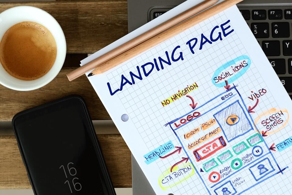
A landing page is a specially designed page on a website that your customers reach after clicking an URL on an online ad, email, or social media post. It is specially designed to promote a product or offer, and it must contain a Call To Action (CTA) that tells the customers specifically what they need to do to buy your product, get a discount, contact your company, etc.
Landing pages are important for most marketing campaigns and unless they are well-designed and conversion-oriented, the campaigns will never perform according to their true potential.

Landing Page Optimization
If your landing pages are not performing well then you must apply a technique called Landing Page Optimization on them to make them more customer-focused. Landing Page Optimization is part of a larger strategy called conversion rate optimization and is something that every business must undertake occasionally to keep the landing pages in top shape.
Landing Page Optimization is a technique that you need to continuously apply to your website if you want to increase your sales. Without a proper landing page that accurately and specifically talks about your product and offer it is highly likely that the customers will not understand what to do and abandon your site quickly. This can lead to big problems for any business, especially a startup.
Landing Page Optimization Should Be Data Driven
The first thing that you need to know about Landing Page Optimization is that it must be based on real-life data. Unless you have an idea of what is working and what is not, all your Landing Page Optimization efforts will be based on trial and error which will be highly time-consuming and costly.
You can run a Heatmap on your existing landing page to understand which part of the landing page the customers are spending time on and what is causing them to leave. This will give you a fair idea of the parts of the page you need to focus on and what you need to change.
You may experiment with multiple variations of the landing page by tweaking one element at a time. You can run an A/B Test of these pages to understand which ones are converting better. After the A/B Test is over, keep the version that performed the best. If none of them worked well, then make further changes in the elements and run the A/B Test again.
While doing A/B Tests make sure that you change only a single element in a page and then run the test. If you make multiple changes then you will get confused about which ones to retain.
Some Essential Landing Page Optimization Techniques
Now let us look at some of the Landing Page Optimization best practices and techniques which will make your landing pages more attractive and conversion oriented.
1. Make The Pages Simple And Easy To Understand
I have seen many landing pages which are long and too complex for visitors to understand. They talk on and on about the product and the users have to scroll down multiple pages before they even reach the CTA.
Please understand that in today’s world most of your users are impatient and they will not read so much text to understand what they need to do.
My recommendation is to opt for a lean landing page that will be precise, direct, and no-nonsense. Explain your offer to the customer in a concise way and present the CTA to them.
You may add additional information after the CTA for those who might be interested in reading more.
Caution!
Don’t make your landing page so short that people do not understand the offer at all. The idea is to present all the information concisely to the customer so that they get motivated to take the action that you want them to.
2. Use An Attractive Design
Customers do not enjoy spending time on a page that is badly designed. By bad design, I mean the incorrect choice of colors and font. Let us discuss these, one by one.
A. Color
The colors that you use on your landing page should be soothing and must not cause eye strain to the customers. Similarly, avoid having a page that is colorless and dull.
Use a properly matched color scheme on your landing pages. Also, using soothing contrasting colors as well as black text on a white background is an excellent choice for any landing page.
You can use the Material Design Tool by Google to find a good color combination for your landing page.
B. Font
Make sure that the fonts that you use on your website are modern, legible, and clear. I would suggest that you avoid fonts that look old-fashioned or ones that have a complex texture.
Elementor and Canva have curated a list of google fonts that look great on every website. This will help you to choose the fonts that you think will match your learning page design.
3. Make The Design Consistent
Remember that the customers will reach your landing page after clicking a link on a marketing campaign (i.e. advertisement, email, or social media post) of your company. A best practice that can dramatically increase your conversion rate is to ensure that the design of the landing page matches the design of the marketing campaign that they have seen
Using the same design will help the customers to relate the landing page to the campaign and they will perform the action that you want them to. If you use different designs everywhere, then continuity will be lost, and the users will leave the landing page quickly.
4. Use Proper Headlines
Headlines will be the first thing that the customers will see when they reach your landing page. Make sure that you have at least one major headline at the beginning of the page which tells the customers clearly what the landing page is promoting.
It is best practice to divide the content of the landing page into several distinct paragraphs. Each section should start with a subheading. This will give the customers a clear idea about what the paragraph is all about so that they will choose whether to read it or not.
A good copywriter will be able to help you to create headlines that appeal to the psyche of the customers. The headline should also have important action words that make the customers mentally prepared to take action when they hit the CTA block.
5. Use The Above The Fold Space Cleverly
Most users do not like to scroll down too much due to either a shortage of time or patience. Therefore, you must use the above-the-fold section (the top of the landing page) to your maximum advantage.
Make sure that you present the most important parts of what you have to say at the top of the page. Do not save the best for the last.
Remember that unless you can capture the attention of the customers as soon as they see the landing page, it is most likely that you will lose them quickly. They will leave the page even before properly reading what you have to say.
Using the above the fold space correctly is critical to the success of your landing page and your marketing campaign.
6. Make Your Offer Clear
The product or offer should be presented to the customer in unambiguous language. Writing the offer in a roundabout way or using complex language or uncommon words will confuse your users and they will lose interest quickly.
7. Use The Same CTA Everywhere
Never confuse your customers by putting in multiple calls to action which they might find confusing. For example, I have seen landing pages that feature the following:
- A primary CTA requests the customers to fill up a lead form.
- A popup asking the customer to subscribe to the mailing list
- Social media sharing buttons ask the customer to share the offer with their friends and family members.
Having so many CTAs will surely confuse your customers and they may simply miss the most important one. For example, they may just subscribe to your mailing list and leave the page, leaving your primary objective of getting them to submit the lead form unfulfilled.
A better way to put the CTA would be:
- Put the primary CTA (asking them to submit the lead form) in the landing page.
- Once they fill up the lead form take them to a Thank You page where you show them the social media sharing buttons.
- You may also show the popup for email list subscription on the Thank You page.
In this way the landing page becomes clutter-free, and the customers are presented with only the primary CTA. They will not have any difficulty understanding what they are supposed to do and the chances that they will fill up the lead form will increase.
8. The CTA Should Be Clear And Attractive
One big mistake that I have seen many marketers make is that they explain the offer on the landing page and think that the customer will understand what they need to do next.
This is far from being true.
Please understand that since you have created an offer you know exactly what it is about. However, most customers need to be told what they need to do next.
A clear and concise CTA will ensure that the customer does not get confused and the chances that they will take action on the landing page before leaving it increases manifold.
Here Are Some Good Calls To Action:
- Buy now
- Join now
- Get $50 off
- Sign me up
- Request a callback
9. Create A Sense Of Urgency
Deadlines work very well in the world of marketing. So instead of showing your customers an offer that runs forever, you may add expiry to it. Some landing pages even feature a countdown timer that shows how many hours or days are left for the offer to run out.
Creating a sense of urgency is likely to get the customers to act instantly. It is also a wonderful way to convert fence-sitters, who are undecided about whether to buy or not.
10. Add Social Proof
If your product is highly rated or has received some great testimonials from your customers, then you must mention that on your landing page.
When your customers see these, they will feel a lot more comfortable clicking the CTA button. After all, what can be better than hearing from people who have already used your product and benefited from it?
Some Examples Of Great Landing Pages
HubSpot has curated a list of great landing pages which are well-designed and contain all the best practices mentioned here. You can go through them and use the learning to improve your landing pages.
These were some of the Landing Page Optimization tips for you to make your landing pages more attractive and conversion oriented. If you need any help, feel free to contact us.
Do you think some other points can be added to this list? Feel free to comment below and let us all gain from the knowledge.


Leave a Reply